Imagine a world where you're limited to accessing only 10% of the entire internet. While this might sound like a distant scenario, it's the reality faced by 1.3 billion people worldwide (and more than 800k in Norway) who live with disabilities. For these users, accessing online content remains a challenge, largely due to the lack of web accessibility practices adopted by businesses and individuals alike.
In this article, our focus turns to understanding why accessibility is so important. It should help you to ensure your website is accessible to all as it's not just a moral imperative but also a strategic business decision. We'll explore the standards, principles, and tools that underpin web accessibility, while also providing practical steps you can take to make your website welcoming and functional for everyone.
Web accessibility refers to the practice of designing and developing digital content - including websites, applications, and other online resources - in a way that ensures people with disabilities can perceive, interact with, and navigate them effectively.
This includes individuals with visual impairments who might use screen readers, those with mobility impairments who rely on keyboard navigation, and people with various cognitive disabilities who might require simplified interfaces.
In essence, web accessibility strives to ensure that the online experience is equally enriching and seamless for all users. Next to that, it promotes equal access, equal opportunity, and a more inclusive internet landscape.
Web accessibility is far more than an ethical obligation, it carries legal weight and strategic advantages.
If you are a private company operating in Norway, making your website accessible it's not just an option, but a legal mandate overseen by DIFI, represented by the Authority for Universal Design of ICT, which makes random controls, typically at large companies.
Normally the report is published on the DIFI website, and the company gets a fix-list with a deadline. Failing to comply with their norms can finally lead to high fines.
It was the case of SAS in 2018: DIFI identified numerous accessibility issues on their website. Given a ten-day deadline, not fixing these issues would result in fines of approximately 150,000 NOK per day.
From a competitive point of view, according to a study conducted by LevelAccess in 2021, 38.6% of employees reported that their product’s level of accessibility was called out as a reason for purchase by customers. At the same time, Gartner Research confirms that Digital products in full Web Content Accessibility Guidelines (WCAG) Level 2 compliance are expected to outperform their market competitors by 50% by 2023.
Nowadays, brands with inaccessible websites are failing to accommodate a growing portion of the population. The number of people living with disabilities is expected to grow considerably over the coming decades which will only give rise to more guidelines, legislation, and enforcement.
So, what are the guidelines for a website to be accessible enough?
The Web Accessibility Initiative (WIP) of The World Wide Web Consortium (W3C) is responsible for publishing the Web Content Accessibility Guidelines (WCAG), a document that covers a wide range of recommendations for making Web content more accessible. These are organized under 4 principles, known as POUR, which include:
Then, for each guideline, there are success criteria or standards which will tell you how much impact it has on accessibility.
Those are categorized into three levels:
Creating an accessible website involves a series of practical steps, aimed at ensuring usability for everyone, regardless of their abilities. While these guidelines do not encompass every legal requirement, they offer a robust starting point for enhancing accessibility.
Keyboard Navigation, mainly for users relying on keyboards or screen readers.

Magnification and Responsive Design
Colors and Contrast
-1.png?width=1400&height=780&name=Untitled%20design%20(3)-1.png)
Headings
Links, essentials for navigation and interaction.
Images and Videos
Forms
Page Titles

Code Validation, crucial for compatibility across browsers and devices. Ensure:
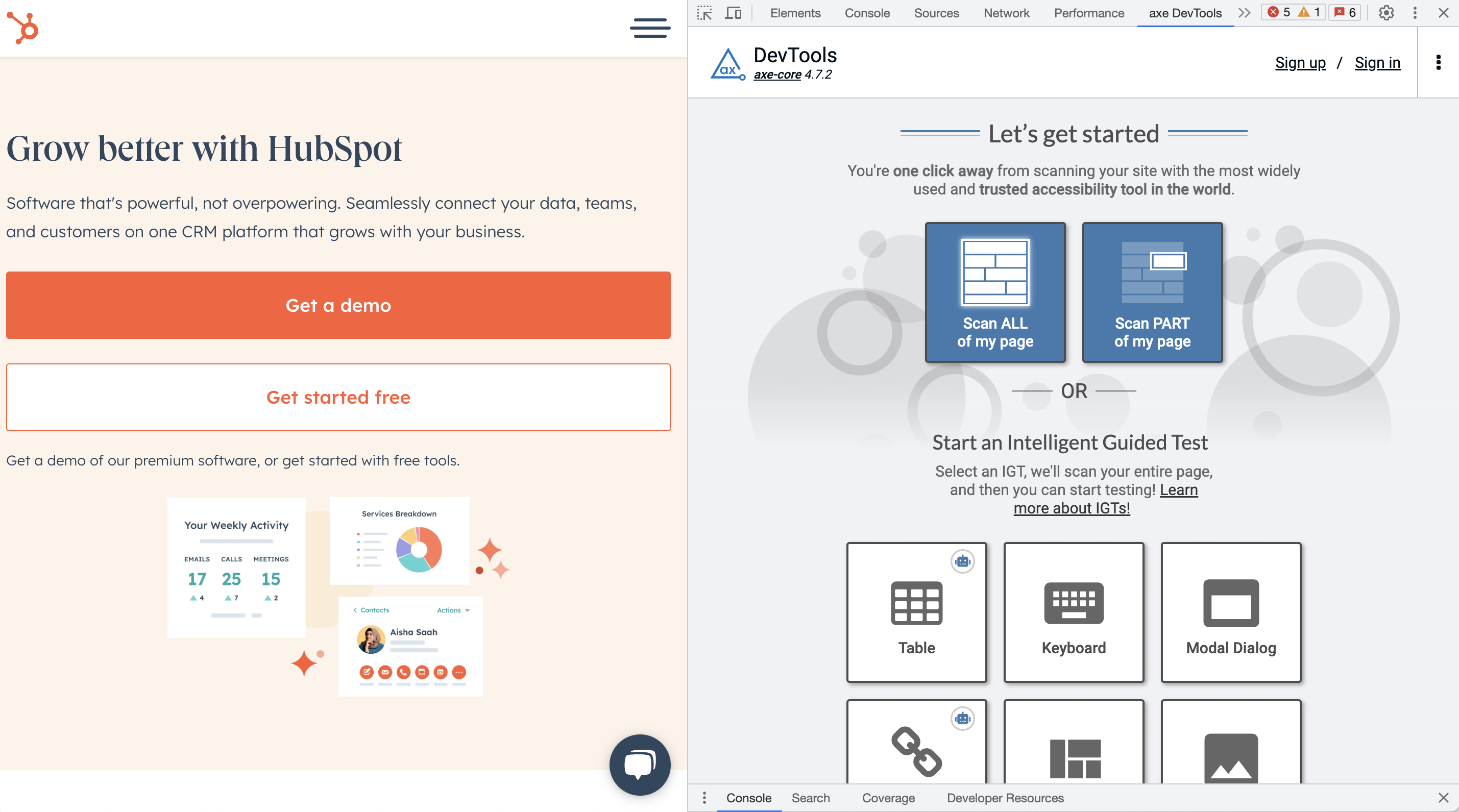
Even if evaluating your website's accessibility could involve in-depth expertise, there are effective tools and methods that can provide valuable insights into your site's accessibility level.

The journey to web accessibility begins with awareness, extends through action, and transforms into inclusion.
A key factor in achieving this transformation lies in choosing the right CMS. HubSpot stands out as a prime example, seamlessly integrating accessibility features like responsive design, alt text, structured content, and more. With HubSpot, creating an inclusive website becomes streamlined, aligning technology with inclusivity goals. Similar approaches can also be found in other CMS platforms, such as WordPress and Wix.
By understanding the importance of web accessibility and taking effective steps, you're not just improving your website, you're also contributing to a digital landscape where everyone is welcomed.
Copyright Utbrudd 2026. Org nr: 911 880 865. Cookies og personvern.